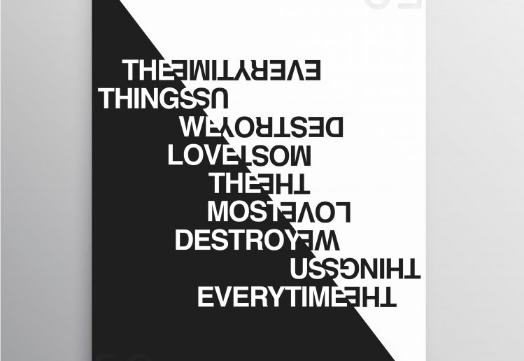
The following two simple designs are Asymmetric and Symmetric layout of blocks of fonts respectively.
Talking about the first design, it consists of fonts of different sizes and stroke thicknesses. Also, they are in contrast color so the design looks clean and simple. The two sides of the design are differentiated by the different sized letters. One side is heavier than the other. The contents are totally random so it perfectly fits the asymmetrical design category. The overall design is not cluttered, we can read everything on it. The white space itself is a design element creating a sort of design elements similar to the black one.
The second design, however, is the symmetrical layout of fonts to create a sort of similarity design to one half of the design to the other. This design also uses contrast color and clean layout of fonts to be able to read everything rather than just being a design. The whole design has the same font of the same size. The main design is the diagonal split right in the middle. It separates the two half of the design and saving the symmetry.


